

I've spent more time than I'd like to admit staring at a blank Framer canvas, wondering why building a portfolio still feels harder than the actual work inside it. The irony isn't lost on me. You can design entire brand systems for clients, but when it comes to your own site, suddenly every decision matters too much.
That's where Framer portfolio templates come in. And honestly, they've saved me from myself more than once.
💡 Ready to build your own site? Check out my Framer portfolio templates to get started right away. Explore templates
Why use a template at all?
Let me be clear about something. Using a template doesn't mean you can't build from scratch. It means you're smart enough to recognize when starting from zero isn't the best use of your time.
I build my own sites from scratch in Framer. But I've been using Framer for years, and I know my way around it. For most designers who just want a solid portfolio online without spending weeks learning the tool, a template is the smarter starting point.
The math is simple. You could spend 40 hours learning Framer, figuring out components, and building every section from the ground up. Or you could spend 4 hours customizing a solid foundation and use the other 36 hours on actual client work. That's not laziness. That's business sense.
Framer templates also come with a few practical advantages worth mentioning:
No code needed. Build a website without touching a single line of code.
Fully customizable. Tweak colors, fonts, layouts, and more.
Responsive by default. Your site works on any device without extra effort.
Fast and optimized. Most good templates are built with performance in mind.
What makes Framer portfolio templates actually useful
Not all Framer portfolio templates are built the same. I've tested enough of them to know what separates the good from the "why did I pay for this" category.
What you actually need:
Clean project presentation that doesn't compete with your work
Responsive layouts that don't break on mobile
Fast loading times (clients won't wait for fancy animations)
Easy customization without diving into code
What you don't need:
Seventeen different homepage variations
Animation overkill that slows everything down
Complicated component structures that make editing a nightmare
Features you'll never use
The best Framer portfolio templates give you structure without being rigid. They look professional out of the box but don't scream "template" once you're done with them.
The best Framer portfolio templates in 2026
Here are the ones I'd actually recommend, based on design quality, ease of use, and how well they hold up once you start customizing.
Refined by Marc Kuiper
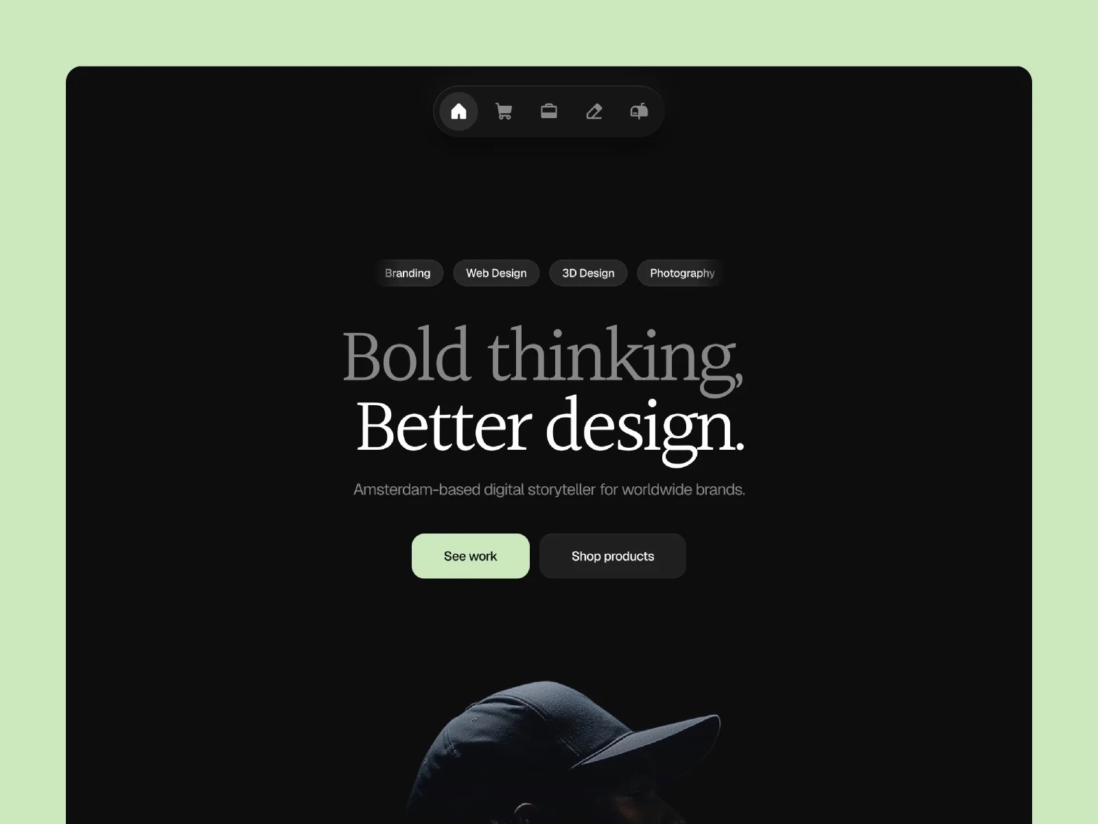
A clean, minimal template made for creatives, freelancers, and entrepreneurs who want a simple way to showcase work and sell digital products.
Minimalistic design
App-style navigation with smooth transitions
Ability to sell digital products
Optimized for fast loading
Farrok by Gustave Flowbert
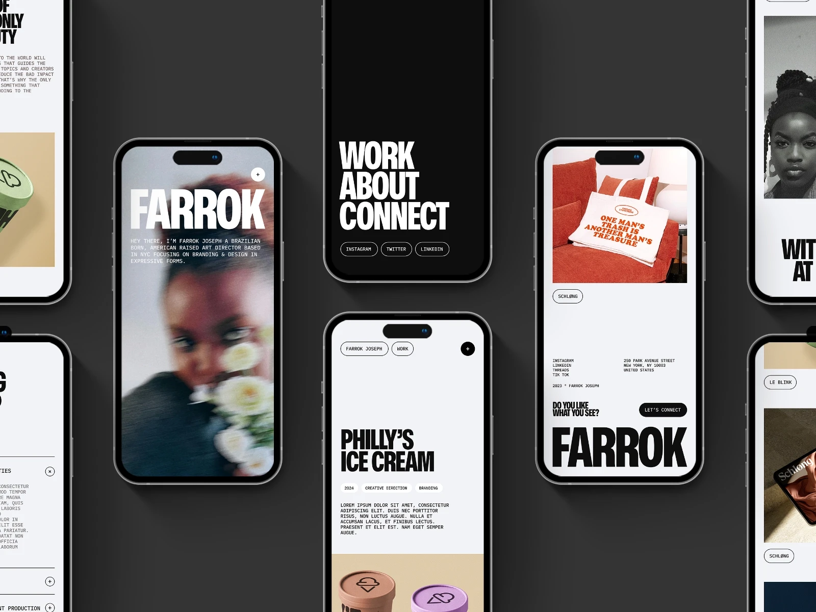
Built for agencies and studios that want their projects to feel substantial. Leads with large images and bold typography.
Robust, impactful design
Versatile feature sections
Engaging project showcases
Interactive elements
Offset by Bryn Taylor
A clean, no-nonsense template for designers. One of the more straightforward options on the marketplace.
Minimalistic design
Dark and light mode available
Fast, accessible, and SEO-ready
Very easy to set up
KIM by JP
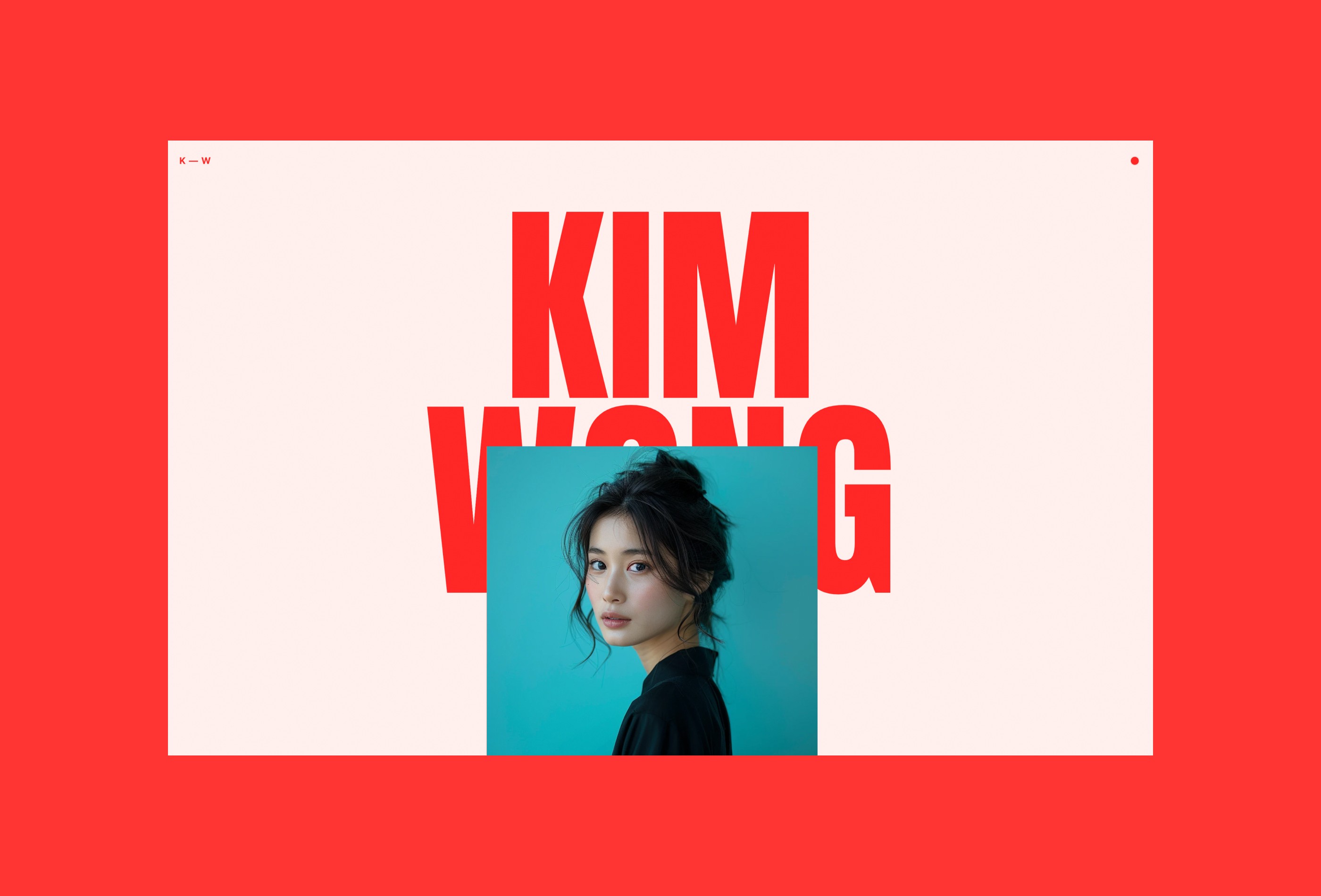
Stands out if your work is expressive and you want the portfolio to match. Strong typographic detail throughout.
Bold titles and bright colors
Smooth scroll animations
Full width images
Strong typographic detail
Blnk by Clonify
A solid choice if you want to keep things understated and elegant.
Light and dark theme
Minimalistic approach
Eight different page types
Aliah Johnson by Kanso
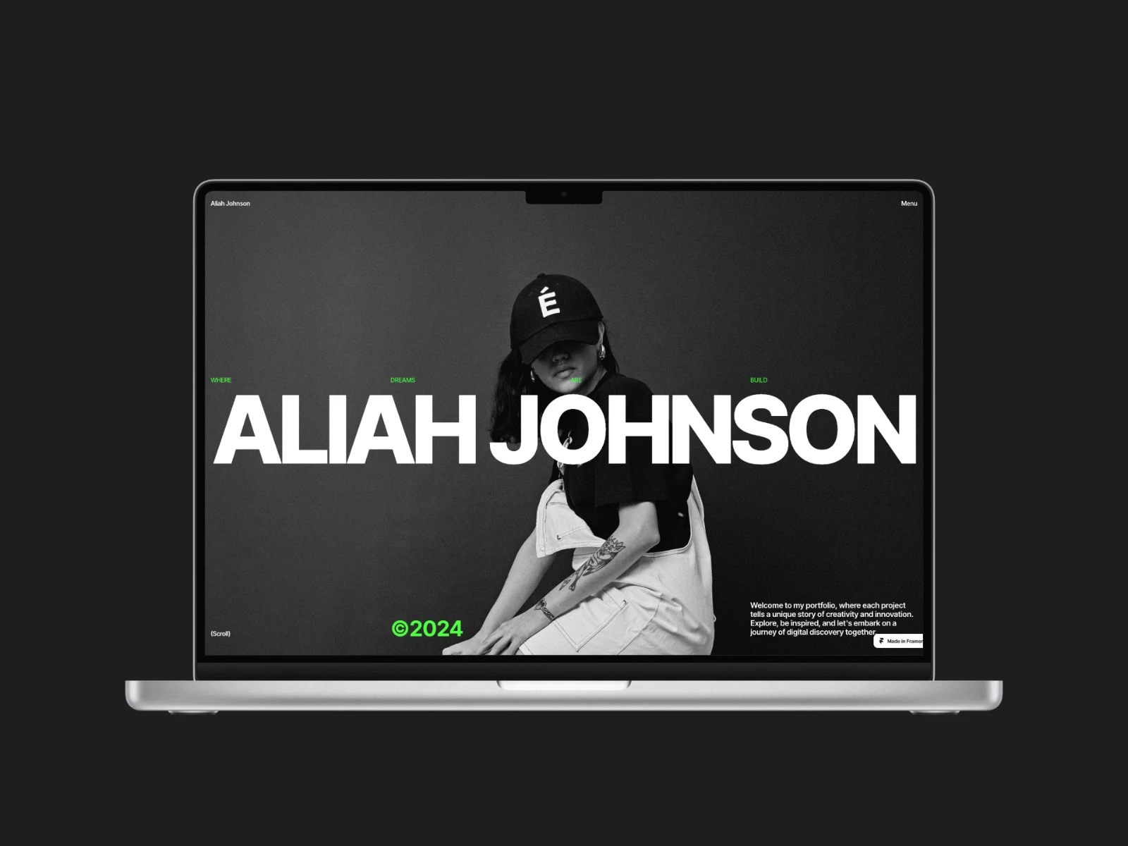
Good for creatives whose work benefits from a more dynamic, animated presentation.
Satisfying loading animation
Full width menu overlay
Large images
Bold typography
FF Minimal by Favorit x Frame
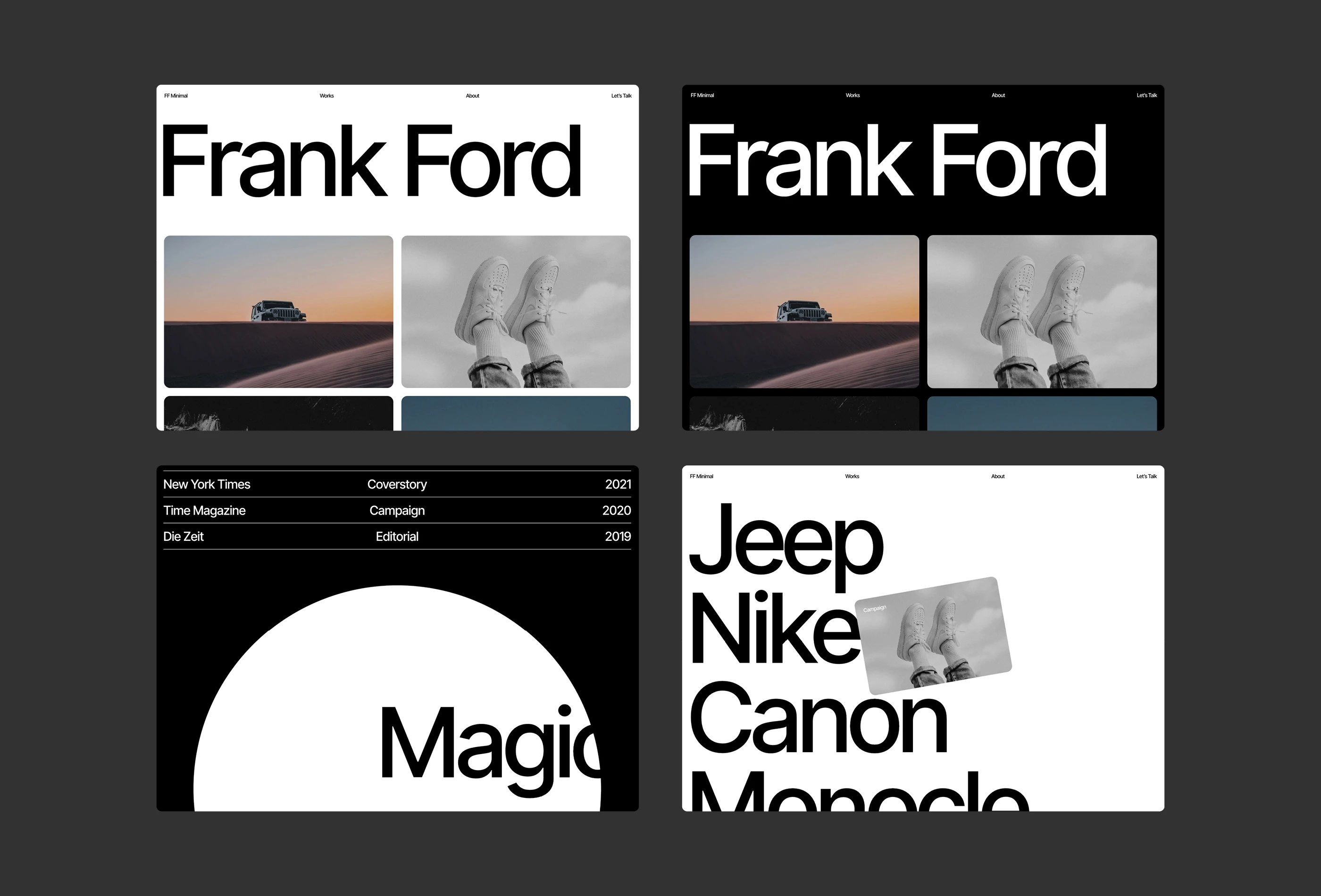
No distractions. If your work is the only thing you want people to focus on, this template gets out of the way and lets it.
Black and white theme
Large images
Smooth animations
Bold typography
Display by Marc Kuiper
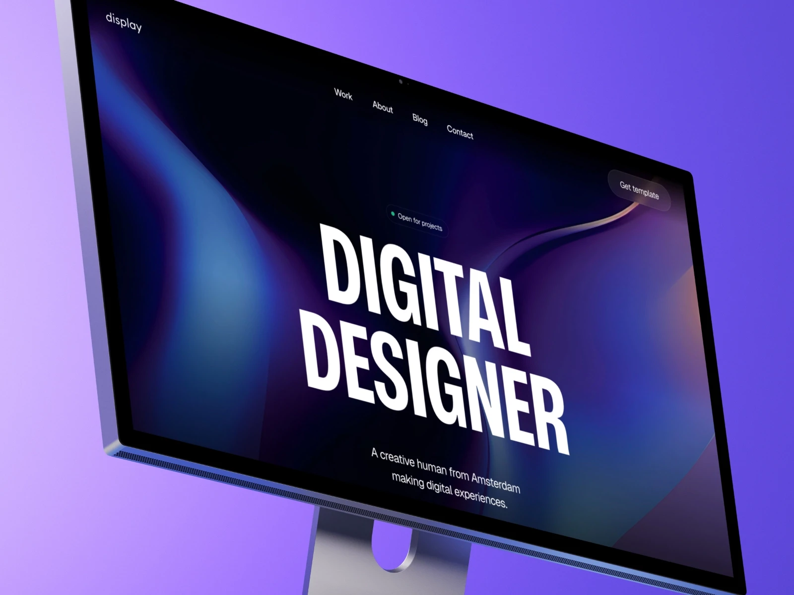
A minimal all-in-one portfolio template built for creators and entrepreneurs.
Dark themed design
99/100 on Google PageSpeed
CMS support for portfolio work and blog posts
Very easy to set up
How to pick the right one
I have a simple test. Open the demo. Imagine your best project in the featured spot. If you can see it working without major surgery, that's a good sign. If you immediately start thinking "I'd need to rebuild this entire section," keep looking.
A few questions worth asking:
Does the template's style match your work, or are you going to fight it the whole time?
Can you easily swap in your own project images and case studies?
Does it have the pages you need without a bunch you don't?
Is the file structure clean enough that you can find things later?
That last point matters more than you think. I've used templates where finding a specific text layer felt like archaeology.
The customization reality check
Here's what nobody tells you about customizing Framer portfolio templates. The first 80% is easy. The last 20% is where you'll spend 80% of your time.
Swapping colors, fonts, and images? Fast. Adjusting layouts to fit your content? Still pretty quick. Making that one section do exactly what's in your head? That's where the hours go.
The smart move: stick to customizations in the easy to medium range unless you have a strong reason not to. Your clients care about seeing your work clearly. They don't care about the parallax effect you spent six hours perfecting.
Common mistakes I see people make
Template hopping. You buy a template, start customizing, hit one frustrating thing, abandon it, buy another one. I know someone who owns seven portfolio templates and has never finished any of them. Pick one. Commit. Ship it.
Over-customization. The template already works. You don't need to redesign every component to make it yours. Change what matters and ship it. You can always refine later.
Ignoring mobile. You test everything on your 27-inch monitor and it looks great. Then you check your phone and half the text is unreadable. Check mobile first. Always.
What a template can't fix
No template will fix bad portfolio content. I've seen designers spend weeks perfecting their site structure while showing projects with two screenshots and a paragraph of lorem ipsum.
Your portfolio needs clear project descriptions that explain the problem and solution, enough visual examples to understand your work, context about your role and the outcome, and contact information that doesn't require a treasure hunt.
A Framer portfolio template gives you the container. You still need to fill it with something worth looking at.
Free vs paid templates
The free vs paid debate matters less than you think. I've seen beautiful free templates and terrible paid ones.
Free templates work when you're just getting started, need something up fast, or are willing to accept some limitations. Paid templates make sense when you want better documentation, support, or specific features that aren't available in the free options.
A reasonable approach: start with a free template, ship it, make some money, then upgrade when your portfolio actually becomes a conversion problem.
The maintenance question nobody asks
You'll need to update your portfolio. New projects, new direction, new work. Can you do that six months from now without dreading it?
I update mine every few months. New work in, old work out. Takes about an hour because the template handles the structure. I just swap content. That's exactly how it should work.
If updating your portfolio feels like rebuilding it every time, you picked the wrong template.
A good Framer portfolio template gets you online fast so you can focus on the work that actually builds your career. Browse the full range at Holygrid Framer templates if you want options that are built to be modified, not just admired.


