

Every designer reaches that point. You know you need a portfolio. You open a blank canvas, stare at it for twenty minutes, close it, and tell yourself you'll start tomorrow.
The problem isn't motivation. It's that starting feels overwhelming. You're making hundreds of decisions at once: layout, typography, colors, structure, content. And you're doing all of that before you've written a single word about your actual work.
This guide cuts through that. Here's what actually matters when building a portfolio website, in a practical order you can follow.
What your portfolio actually needs to do
Before you touch a design tool, it helps to be clear about the job your portfolio needs to do.
A portfolio website has one job: convince the right people to reach out. Everything else is secondary.
To do that well, you need:
A clear homepage that communicates what you do and who you do it for
A focused selection of your best work, not everything you've ever made
Case studies or project pages that explain the problem, your process, and the outcome
An about page that feels like a person wrote it
A contact section that makes it easy to get in touch
That's it. You don't need a blog. You don't need a shop. You don't need twelve pages. You need those five things done well.
Choose the right platform
The platform you build on shapes how fast you can work and how much control you have over the result. For designers, a few options stand out.
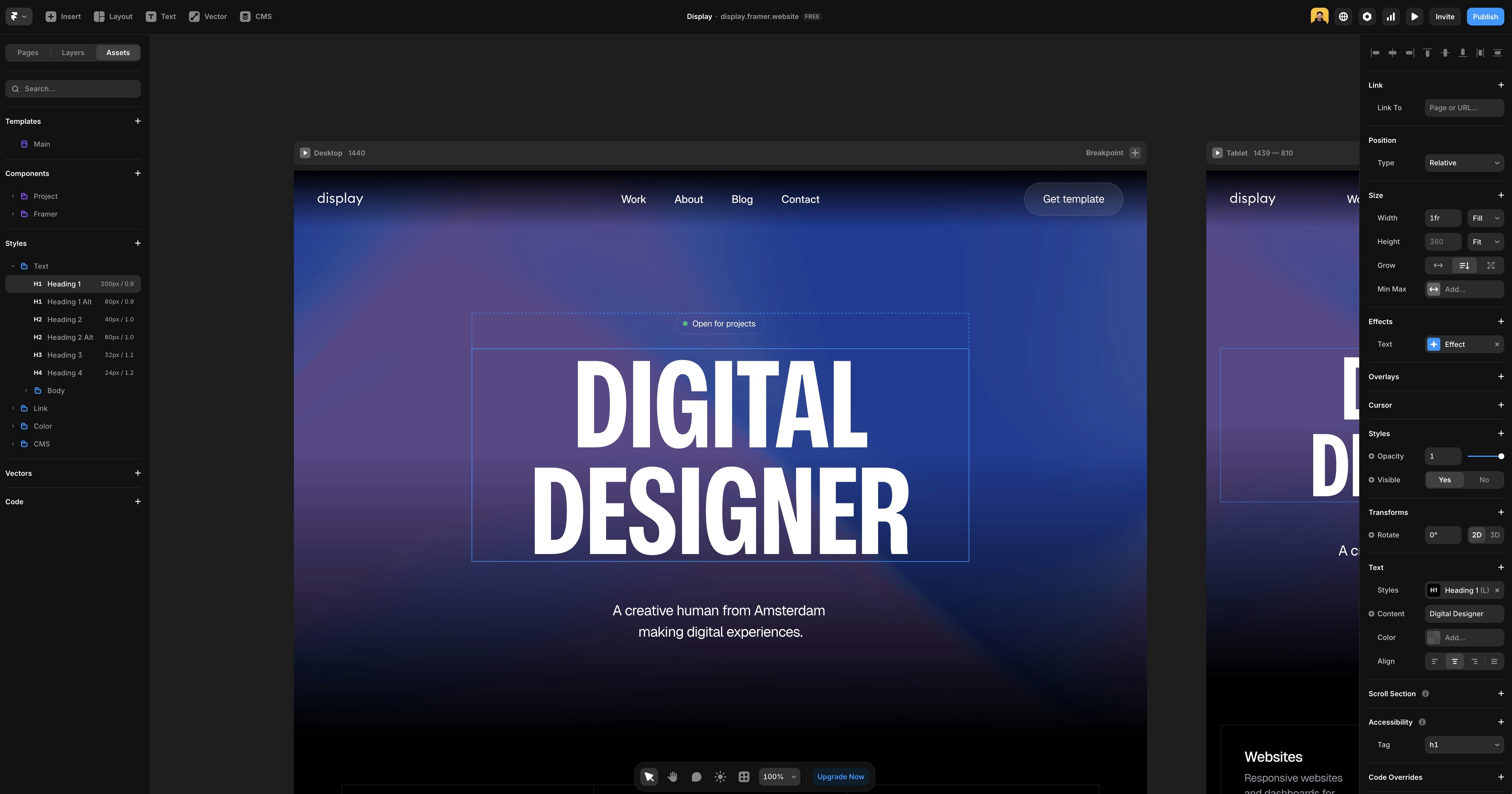
Framer is built for designers. The canvas works like Figma, the output is a fast, clean website, and you don't need to touch code unless you want to. Animations and interactions are built in. You publish directly from the canvas. For a portfolio site, it hits the right balance between design control and publishing speed.
Webflow gives you more technical control and a more powerful CMS. The learning curve is steeper, but if you're building something complex or want granular CSS control, it's worth the investment. For a straightforward portfolio, it's probably more than you need. The Framer vs Webflow article covers the differences in detail if you're deciding between the two.
Squarespace is the easiest starting point. The templates look good and setup is fast. The trade-off is limited design flexibility. You'll hit walls quickly if you want something that doesn't fit their grid.
For most designers who want full creative control without writing code, Framer is the strongest choice in 2026.
Plan your structure before you design
A common mistake is jumping straight into design before deciding what the site actually needs to contain. Spend an hour on structure first.
For most designer portfolios, this works well:
Home — who you are, what you do, a few selected works, a clear call to action
Work — your project list or case studies
Project pages — one page per project with context, process, and outcome
About — your background, approach, and personality
Contact — how to reach you, as simple as possible
Keep it lean. A focused five-page portfolio is more effective than a sprawling ten-page one. Clients rarely read everything. They scan, click on one or two projects, and decide from there.
Choose your best work carefully
This is where most portfolios go wrong. Designers include too much because it feels safer to show range. In practice, it dilutes the impression.
Three to five strong projects beat ten mediocre ones every time. If you're not proud of something, don't include it. Clients look at your weakest piece and assume it represents your standard.
A few questions worth asking for each project you're considering:
Does this show the kind of work I want more of?
Can I explain the problem, process, and outcome clearly?
Is the visual quality something I'm genuinely proud of?
If the answer to any of these is no, leave it out.


Write case studies that actually convert
The project page is where a portfolio either wins or loses a client. Most designers treat it as a visual showcase. The best ones treat it as a story.
Every case study should answer three questions:
What was the problem or challenge?
What did you do, and why?
What was the outcome?
Keep it concise. A few paragraphs and strong visuals beat a ten-minute scroll. Include your role clearly, especially if it was a team project. Clients need to understand what you specifically contributed.
Avoid vague language like "improved the user experience" without explaining how or what changed. Specific outcomes, even rough ones, are always more convincing than general statements.
Write an about page that sounds like you
The about page is consistently one of the most visited pages on a portfolio site. Most designers either skip it or write something that reads like a CV.
Write it like you're talking to someone. Explain what you do, what you care about, and what it's like to work with you. A bit of personality goes further than a list of tools and years of experience.
If you're not sure where to start, answer these questions in plain language and then edit from there:
What kind of designer are you?
What do you enjoy working on most?
What does a client get when they work with you?
That's enough for a good about page.
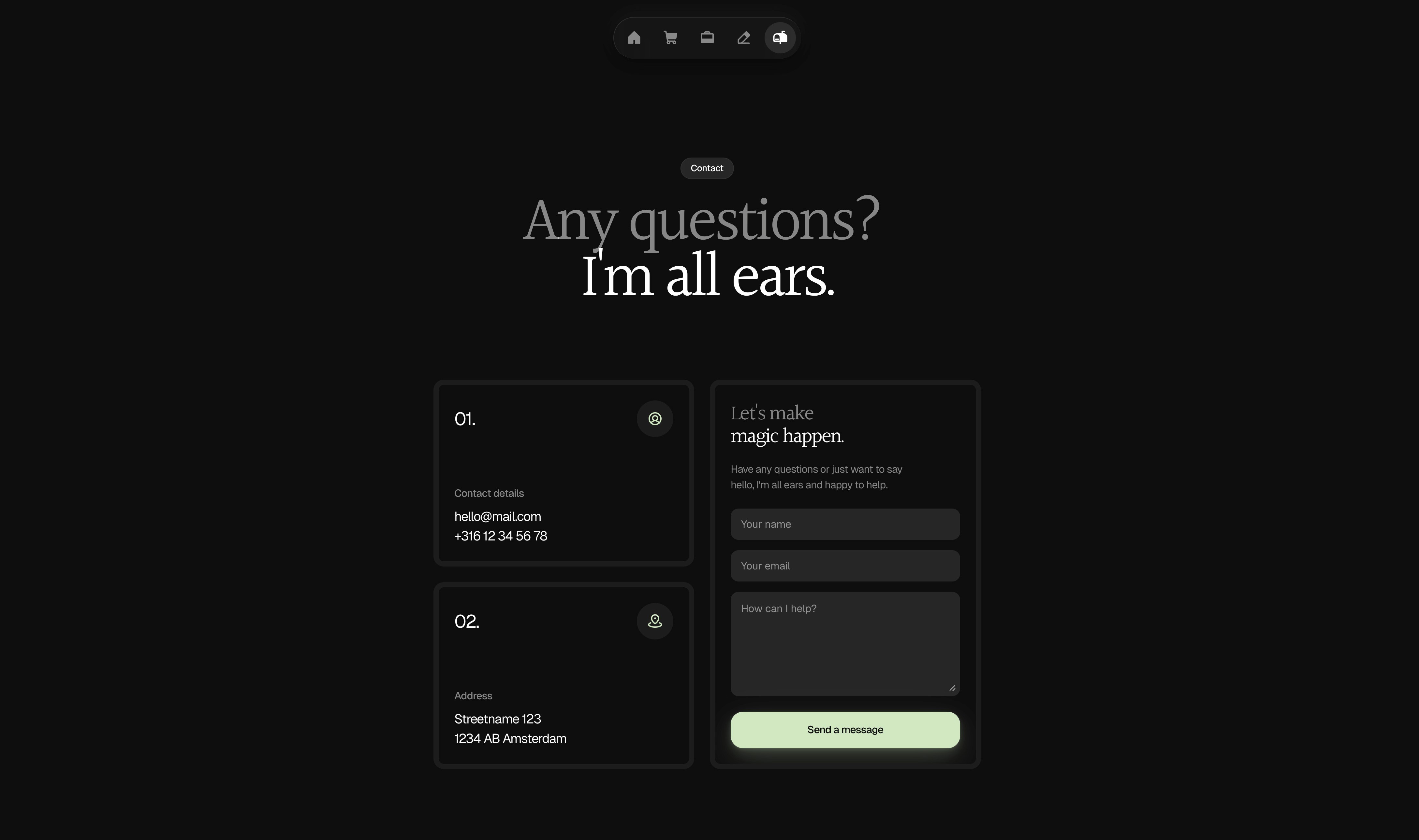
Make it easy to contact you
A surprising number of portfolios make contact harder than it needs to be. A buried email address in the footer, a contact form with five fields, or no contact option at all.
Put your contact information somewhere obvious. In the navigation, at the bottom of every project page, or both. The simpler the better. A single email address or a short contact form is enough. Don't make someone work to hire you.
Get your portfolio found on Google
A portfolio that nobody can find doesn't get clients. Basic SEO is worth doing properly from the start and it doesn't take long.
The essentials:
Write a unique page title and meta description for every page
Use a descriptive URL like
/ux-designer-amsterdamrather than/page-2Add alt text to every image
Use proper heading structure, one H1 per page and logical H2s below it
Connect Google Search Console and submit your sitemap after launch
For a full breakdown of how to handle SEO on a Framer site specifically, the Framer SEO guide covers everything you need.
Ship it, then improve it
The biggest mistake designers make with their portfolio is waiting until it's perfect before publishing. It never will be. There's always one more thing to tweak.
Ship a version you're reasonably proud of and improve it from there. A live portfolio that's 80% of what you want is infinitely more useful than a perfect one that doesn't exist yet.
Set a deadline. Give yourself a week. Add your best three projects, write honest descriptions, publish it. Refine it once it's live.
A note on templates
If you want to skip the structural decisions entirely and focus on content from day one, starting with a well-built Framer template is a legitimate shortcut. A good template gives you a proven layout, responsive behavior across devices, and global styles you can update in minutes. You still bring the content and the customization, but the foundation is already there.
The Holygrid Framer templates are built with this in mind. Clean components, sensible structure, easy to make your own. The Refined template is a good starting point for a minimal portfolio that also supports selling digital products.
Building a portfolio website as a designer doesn't have to take weeks. Get the structure right, choose your best work, write like a person, and publish. Everything else is refinement.


